
Em and relative unit
If you are using Gutenberg editor, you may see something like this:
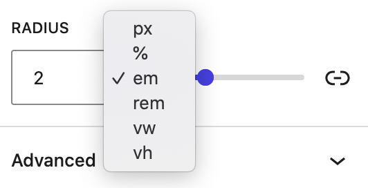
They are all the length units used in CSS. All of them are relative units, except for px. And among the relative ones, em is the most popular. It is a measure used in typography, referring to a specified font size. In CSS, 1 em means the font size of the current element; its exact value varies depending on the element you’re applying it to.
For example, here are two paragraph blocks, with the same the same padding in em, but different in font-size:
class=”Large“, style=”font-size: 40px; padding: 1em;”
class=”Small“, style=”font-size: 20px; padding: 1em;”
Look at the padding of two blocks, although the padding of both are 1em, but the the result is displayed differently. That is because when rendering, the browser will calculate the padding based on the font-size of the current element.
The computed padding value of the large paragraph is 40px * 1 equals to 40px. Similarly, the small is 20px * 1 equals to 20px.
If another selector targets the same element and overrides it with a different font size, it’ll change the local meaning of em, and the computed padding will change to reflect that.
For example, I add this css code to change the font-size of the small paragraph to 30px:
.small {
    font-size: 30px;
}
The small paragraph will look like this:
class=”Small“, style=”font-size: 20px; padding: 1em;”
Using ems can be convenient when setting properties like padding, height, width, or border-radius because these will scale evenly with the element if it inherits differ- ent font sizes, or if the user changes the font settings.
Using ems to define font-size
When it comes to the font-size property, ems behave a little differently. As I said, ems are defined by the current element’s font size. But, if you declare font size: 1.2em, what does that mean? A font size can’t equal 1.2 times itself. Instead, font-size ems are derived from the inherited font size.
For example, we have HTML markup:
<div>
    <p>We love coffee</p>
    <p class="slogan">We love coffee</p>
</div>
And CSS to style:
div {
    font-size: 16px;
}
.slogan {
    font-size: 1.2em;
}
The output will be like this:
We love WordPress
We love WordPress
Explain: the inherit font-size of the .slogan paragraph is 16px, its computed font-size was calculated by 16px multiply 1.2 equals to 19.2px.
Ems for font size together with ems for other properties
What makes ems tricky is when you use them for both font size and any other properties on the same element. When you do this, the browser must calculate the font size first, and then it uses that value to calculate the other values. Both properties can have the same declared value, but they’ll have different computed values.
<div>
    <p>Hello em</p>
</div>
div {
font-size: 16px;
}
p{
font-size: 1.5em; /* Evaluate to 24px */
padding: 1.5em; /* Evaluate to 36px */
}Hello em
What’s happening here is the paragraph inherits a font size of 16 px from the div, producing a calculated font size of 24 px. This means that 24 px is now the local value for an em, and that value is used to calculate the padding.
Putting it all together
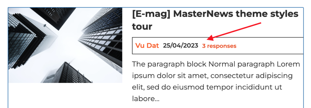
For example, when building a query loop block in a block theme, you want to build a block of post meta info like this. The container block have border and padding, post author name have biggest font-size, post date have medium font-size, and comments have smallest font-size.
Let’s build the structure like this:
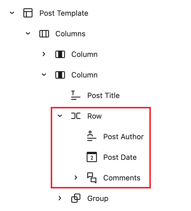
Let’s set the Row with border 1px, padding 0.5em, the Post Author font-size 1.2 em, the Post Date font-size 1.1em. When you change the font-size of the row, everything will be perfectly scaled like this:
Leave a Reply